Canva Craft Journal
Canva Craft Wayfinding Signs: Plan and Proof a Market Route
Use Canva Craft to sketch temporary market signs, then verify every destination and arrow from a visitor’s point of view before printing.
Create an image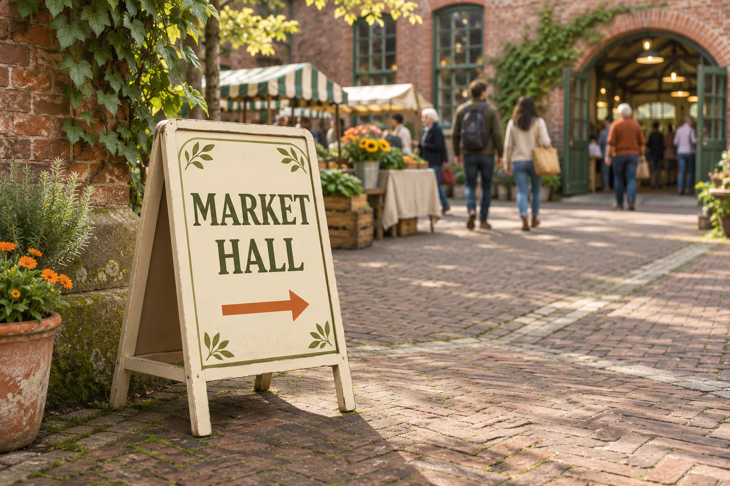
Use Canva Craft to explore the look of a temporary market sign. Decide which way the arrow points by walking the route, then add the verified arrow and destination as editable elements in your final design. A polished mockup can help you choose a layout, but a visitor still needs to see the right instruction before reaching the turn.
In this example, visitors entering a fictional community market reach a fork. The market hall is through the right-hand passage when viewed from the entrance. The sign’s job is to make that choice clear. Use the CanvaCraft image generator to sketch a layout. Canva’s Craft documentation describes how the model plans image composition before rendering.
Illustration of the fictional event setting.
Write the instruction from the visitor’s approach
Stand where visitors will first see the sign. From the entrance, note which passage leads to the hall and where visitors need to choose it. Write down the sign location, the expected approach, the destination wording, and the verified direction.
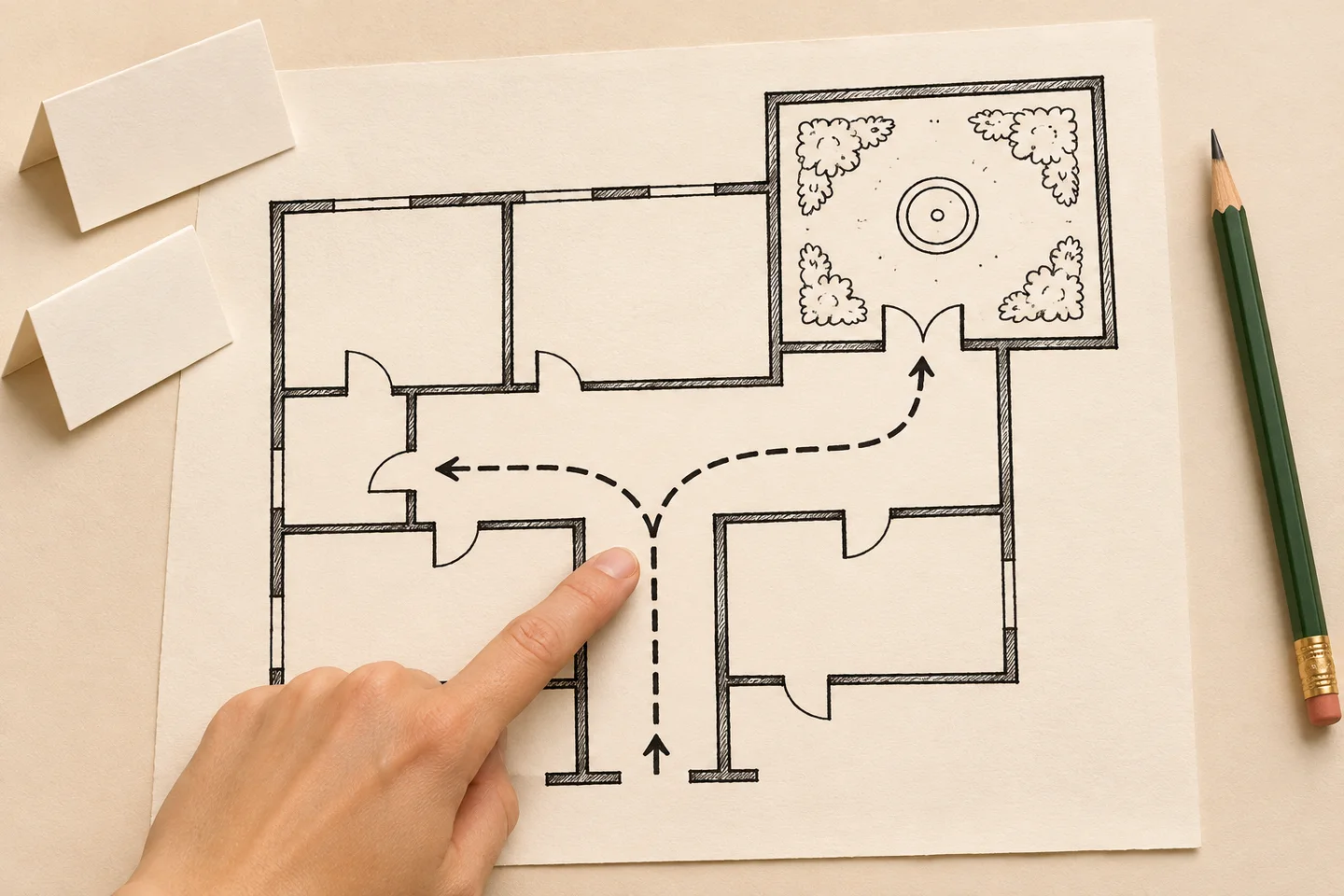
Illustration of marking a decision point before designing the sign.
| Sign location | Visitor approaches from | What the sign needs to do |
|---|---|---|
| Courtyard entrance | Ticket table | Point right at the fork for Market Hall. |
| Hall doorway | Right-hand passage | Confirm visitors have arrived with the words “Market Hall.” |
If people approach the fork from two directions, test each approach separately. Turning the same sign around can change what its arrow means. Use the hall’s actual name consistently so the confirmation at the door matches the first instruction.
Generate the layout, then place the final label and arrow
Give the generator a single visual job. For the market example, explore a high-contrast panel with enough space for a destination and a large arrow. Try this prompt:
Show a portrait sign concept for a small community market. Use a warm cream panel, a dark green border, and a restrained orange accent at the bottom. Leave the upper half clear for a short destination label and the lower half clear for a large direction arrow. Omit text and symbols. Show the panel straight on.
Choose the version with the clearest reserved space. In your design editor, place “Market Hall” and the verified arrow on their own layers. If the artwork makes the label hard to read, remove decoration from behind the wording. The poster text guide has more on visual hierarchy and proofreading. This workflow is for temporary event directions. Follow the venue’s existing procedures for emergency, accessibility, and other required signs.
Walk the route with a proof before printing
Put a proof where the sign will stand and approach it as a visitor would. Can you see it before the fork? Is the destination readable at the point where you need to turn? Does the arrow still read correctly once the panel is on its stand? Ask someone unfamiliar with the layout to try the walk without instructions.
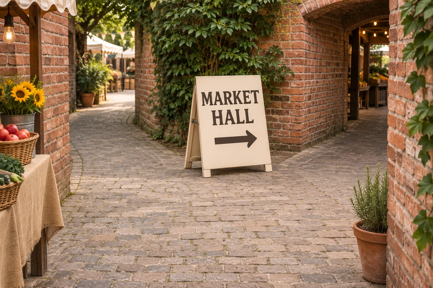
Illustration of checking the sign from a visitor’s approach.
If the viewer sees the sign too late, move it earlier and repeat the walk. If they see it in time but hesitate, simplify the wording or make the arrow easier to distinguish. Confirm the finished dimensions and bleed with the printer, and use the aspect ratio and resolution guide to check any raster artwork at that size. Save the editable design, the approved print file, and the placement notes together so setup staff know where the sign belongs.
Put your next idea into practice.
Start with a written brief in the image workspace.