
Canva Craft Journal
Canva Craft Website Hero Images: Leave Room for Copy and Mobile Crops
Plan a Canva Craft website hero image around the real headline, focal point, and mobile crop. Check the image inside the page before choosing the final export.
Create an image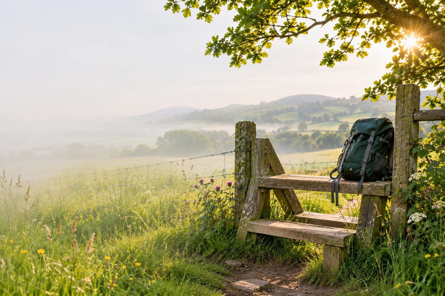
A website hero image has to work with the headline and button that appear over or beside it. Start with those elements, choose a focal point for the picture, and check the composition in the actual page at desktop and phone widths before approving it.
Use the CanvaCraft image generator to explore the artwork. Canva’s Craft documentation describes how Craft plans the layout before rendering, including where subjects and headlines go. For a website, describe the space the copy will occupy and add the final wording in the page.
Plan the picture around the actual headline
Imagine a fictional countryside walking club whose headline is “Find your next quiet trail.” Its button reads “Explore the walks.” If the page puts that copy on the left, the picture needs a quiet left-hand area. A dark backpack on a stile can sit on the right and give the landscape a recognizable focal point.
Editorial illustration for the fictional walking-club brief.
Generate with the copy area in mind:
Wide landscape photograph for a countryside walking club website. Place a dark green backpack on a wooden stile in the right third. Show soft hills and a sunlit meadow. Keep the left half visually quiet, with pale sky and simple meadow tones for a headline and button. Use natural morning light. Omit lettering, logos, and interface elements.
Put the real headline in the page while reviewing candidates. A photograph that looks calm on its own may put branches or a bright cloud behind the second line of copy. If the headline is longer than expected, adjust its layout or request more quiet space in the image. The prompt guide covers describing positions and making a focused revision.
Inspect the phone crop before selecting the artwork
A wide image used to fill a tall phone container can lose much of its left and right edges. Open the page at its phone layout and check where the backpack lands. Also check whether the headline wraps into the subject. Changing the focal point may recover the backpack while moving a busy patch of the landscape behind the text.
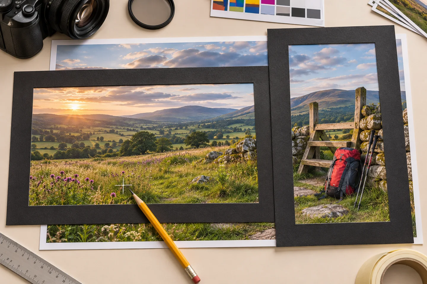
Concept illustration of reviewing crop boundaries.
If the wide and tall layouts need incompatible framing, prepare a separate mobile composition. Repeat the palette, light, and subject description, then ask for a taller arrangement with clear space where the phone layout puts the headline. Review both images together. Separate generations may change the backpack or scenery, so check whether those differences suit the page. The aspect ratio and resolution guide explains how to evaluate dimensions and crops.
Check the headline and button on the finished page
View the final page at the widths where its layout changes. Read the complete headline, find the button, and look at the subject. Keep the text clear against the image at every tested width. If the crop exposes a bright area behind light text, try a suitable overlay, reposition the copy, or simplify that part of the artwork.
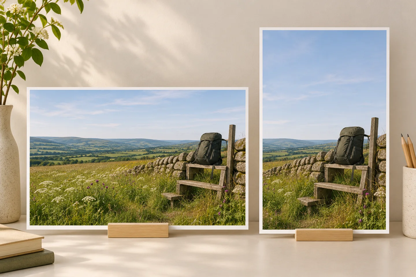
Editorial illustration of reviewing two planned compositions.
The approved file should match the page’s actual image container. Export at an appropriate size, use a web-friendly format supported by the site, and check the delivered image after upload. A preview file on your desktop can differ from the crop and compression visitors receive.
Keep the prompt, selected source, and any mobile variation with a short note identifying the focal point and intended text area. That makes it easier to update the headline later and recognize when the image needs another review.
Put your next idea into practice.
Start with a written brief in the image workspace.