Canva Craft Journal
Canva Craft Multilingual Posters: Localize Copy and Layout
Plan multilingual Canva Craft posters with approved local copy, flexible headline space, and a language-by-language review checklist before publishing.
Create an image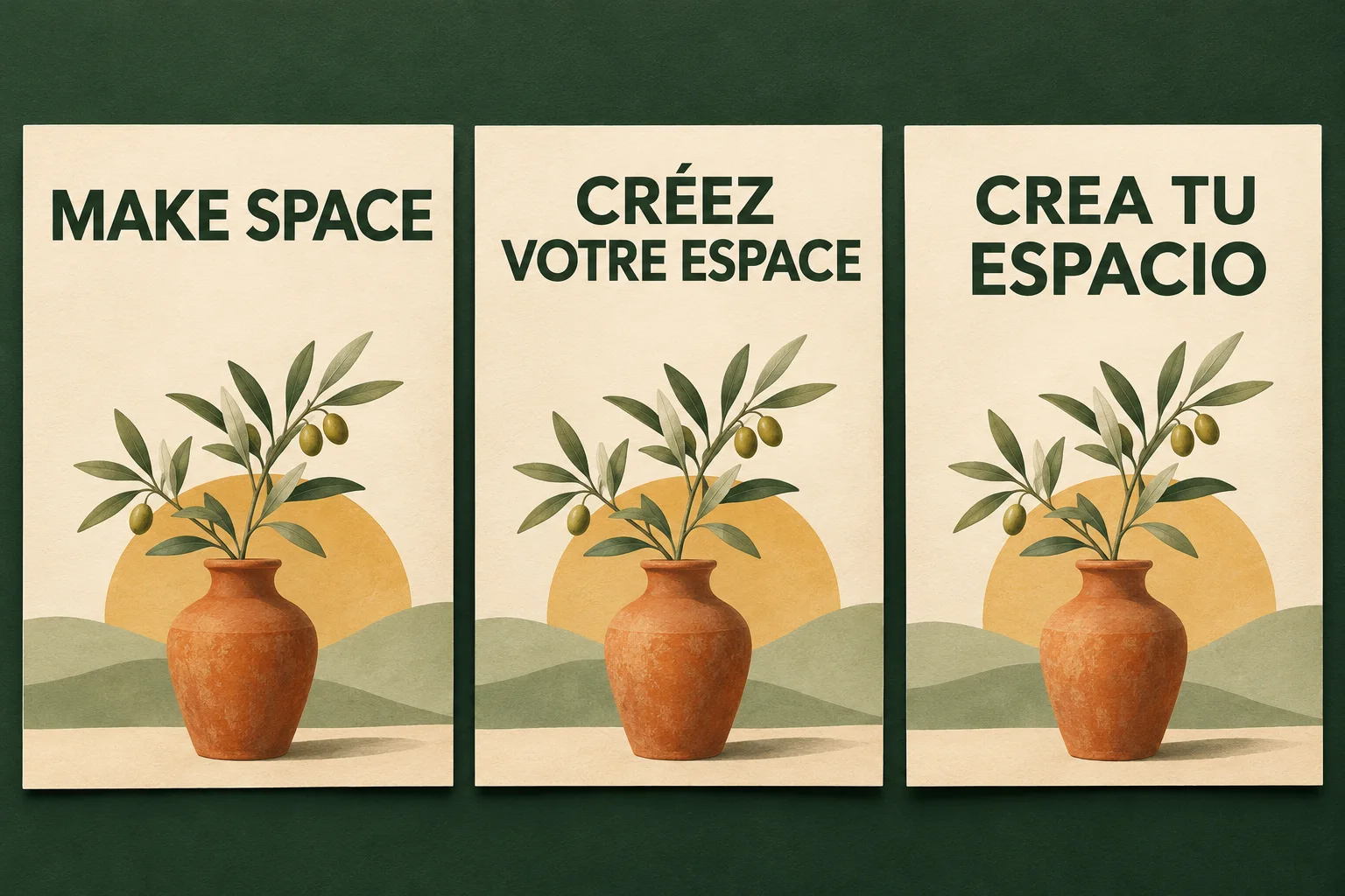
A multilingual Canva Craft poster needs two decisions: what each audience should read, and how that wording fits the design. Approve the copy for each language first, then give every version a layout brief. Keep dates, addresses, prices, and other frequently revised details editable in a design editor.
Canva's Craft announcement says the model accepts prompts in any language and can generate text in 55 languages. It also describes planning composition before rendering. Those are model capabilities, not a guarantee that any particular headline will be spelled correctly or that this site's generator includes automatic translation. This guide turns those capabilities into a reviewable workflow.
The example is a fictional pottery workshop campaign. The prompts are suggested starting points, not recorded tests. CanvaCraft at canvacraft.org is a separate website from Canva's own editor; check the controls available in the tool you use.
Choose what to generate and what to keep editable
Start with one poster per language. This gives a longer headline room to breathe and lets you review each version independently. Put several languages on one poster only when the audience needs them together, such as a bilingual event notice.
There are two useful production routes:
| Route | Use it when | What to review |
|---|---|---|
| Generate the illustration, add local copy in an editor | Copy changes often, or the design contains important event details | Fonts, line breaks, reading order, and the final exported file |
| Generate a short headline with the artwork | You want to explore how lettering and illustration work together | Every letter, accent, word, and the space left for additional details |
For a real workshop announcement, the first route is usually easier to maintain. A change of venue should not require regenerating the vase illustration. The second route can help explore a visual direction, but the finished image still needs a language review.
Canva's announcement discusses Magic Layers within Canva. Do not assume a downloaded image from every Craft-powered website contains editable text layers. Use the actual export options in your chosen editor.
Prepare a copy sheet before a prompt
Give each language its own row in a small working document. Record the intended audience, approved headline, supporting copy, event details, reviewer, and approval status. A language name alone is not enough to settle local wording or formats.
For our fictional campaign, English “MAKE SPACE,” French “CRÉEZ VOTRE ESPACE,” and Spanish “CREA TU ESPACIO” illustrate different headline lengths. These are creative adaptations for a concept, not a claim that they are interchangeable literal translations or approved campaign copy. Have a fluent reviewer confirm the tone for the intended audience.
Lock the details that must stay identical, such as the actual venue name or booking URL. Separately flag details that may need local formatting, including dates, times, and decimal separators. Translate the message before generating the poster; do not rely on the image model to decide what the event means.
Original AI-generated editorial illustration of a localization concept. It is not a Canva Craft output, a real workshop advertisement, or a product interface.
Build one visual brief for the whole campaign
A shared brief helps the versions look related even when their text needs different treatment. Specify the subject, palette, margins, and hierarchy once, then adapt the headline zone to the actual wording.
For the pottery example, keep a terracotta vase and olive branch in the lower half, a cream background, and dark green headline lettering. Reserve a quiet area below the illustration for event details you will add later. Treat these as visual directions, not a promise that independent generations will produce identical artwork.
If matching the illustration exactly matters, reuse one approved background in your editor and change the text there. Generating every language version from scratch may introduce differences in the vase, leaves, lighting, or proportions.
For more on specifying hierarchy, see the Canva Craft prompt guide. The poster text guide covers shorter wording and spelling checks; the extra step here is approving each language and allowing its layout to change.
Start with a text-free background
You can prepare this brief in the Canva Craft image generator, using an available portrait ratio that matches your destination. Do not assume a social image export is automatically a print-ready file.
Create a portrait pottery workshop poster background. Cream paper texture,
terracotta ceramic vase and a single olive branch in the lower half,
muted sage accents, restrained editorial illustration. Leave a large clean
headline area at the top and a quiet footer area for event information.
No lettering, numbers, logos, watermarks, or decorative pseudo-text.
Add the approved local headline as editable text. Begin with a consistent type size across versions, then inspect the longest headline. Adjust line breaks or the size of the headline zone before shrinking the text until it becomes hard to read. A two-line headline in one language can belong to the same campaign as a one-line headline in another.
Use fonts that contain the required characters. Inspect accents and punctuation in the actual exported image, not only in the editor. For a right-to-left version, confirm the destination editor supports the required text direction and have a fluent reviewer check the entire reading order.
Try a short generated headline when it helps the concept
If you want integrated lettering, make one language version at a time. Name the text language and quote the exact wording. Keep supporting information out of this first generation.
Create a portrait concept poster for a fictional pottery workshop.
Cream background, terracotta vase and olive branch in the lower half,
dark forest-green modern lettering at the top. The only visible text is
French: "CRÉEZ VOTRE ESPACE". Arrange it on two balanced lines with generous
margins. Preserve all accents. Leave the footer empty for details to be
added later. No extra words, numbers, logos, or invented event information.
Compare the result with the copy sheet character by character. If the accent is wrong or the model adds words, reject that version. Try a shorter approved headline, or return to the text-free background and set the wording in an editor. Do not silently remove an accent to make a generated result look correct.
When the artwork is acceptable but the headline feels crowded, change one instruction: request a larger headline area or a different line break. Keep a record of the prompt and the specific problem. That makes a revision easier to assess than changing the copy, colors, and composition together.
Review each language as a separate deliverable
Use a compact release checklist rather than approving the set from one attractive thumbnail:
- Meaning: a fluent reviewer approves the wording, tone, and intended audience.
- Characters: compare spelling, accents, punctuation, and any numerals against the approved sheet.
- Layout: inspect line breaks, margins, reading order, and headline prominence at the intended viewing size.
- Details: verify the date, time, venue, booking address, and any local formatting in every version.
- Assets: use your actual logo and approved illustrations; check that the versions share the intended visual identity.
- Export: open each final file, confirm its dimensions, and inspect it after upload to the destination.
For print, follow the printer's specifications for size, bleed, and file format. For digital placement, review a preview in that channel. The aspect ratio and resolution guide helps with shape and pixel dimensions; it does not replace the printer's requirements.
Name files by campaign and locale, then keep the approved copy sheet with them. Publish only the versions that have passed review. One unresolved language should remain pending even if the others are ready.
Questions before you publish
Does multilingual text generation replace translation review?
No. Generating readable characters and choosing the right message are different tasks. Have a fluent reviewer approve meaning and tone, then inspect the rendered text against that approved copy.
Can I use one prompt to make every language version?
A shared visual brief is useful, but separate prompts and approvals make individual versions easier to check. For identical artwork, reuse one background and change editable text instead of expecting separate generations to match perfectly.
Should all headlines occupy the same number of lines?
No. Preserve the campaign's hierarchy and visual identity while allowing natural line breaks for each language. If wording will not fit legibly, ask the reviewer for a shorter adaptation before changing its meaning yourself.
Model claims checked against Canva's official announcement on November 3, 2026. Workflow recommendations and example prompts are editorial guidance; no comparative performance test or Craft generation test is claimed.
Put your next idea into practice.
Start with a written brief in the image workspace.