
Canva Craft vs Midjourney: Poster Layouts or Art Direction?
Canva Craft vs Midjourney is a useful decision when a campaign needs both a striking image and a readable design. Evaluate Craft first when the composition must bring a headline, subject, and supporting details together. Evaluate Midjourney when finding the visual direction is the larger creative challenge and you can finish the layout afterward.
That distinction does not make Craft the only option for a poster or Midjourney the only option for art. It identifies what you should inspect first. A dramatic image may need careful typography, while a well-organized poster can still need a more distinctive visual idea.
This guide uses Midjourney V8.2 and Craft's published capabilities, checked on October 23, 2026. It is a comparison of documented workflows and decision criteria, not a set of measured quality scores. Start a design-led exploration in the Canva Craft image workspace when you already know the message and placement.
At a glance: choose the creative problem
| Decision | Canva Craft | Midjourney V8.2 |
|---|---|---|
| Useful first evaluation | Can one brief organize the image and its information? | Can the workflow establish the visual mood you want? |
| Poster review priority | Hierarchy, copy space, lettering, and complete subjects | Artistic direction, then the fit between the chosen image and final layout |
| Published emphasis | Planning the arrangement of design elements | V8.2's release emphasizes aesthetics, quality, and personalization |
| Prompt controls to check | Describe visual relationships and choose output settings | Check version, aspect ratio, stylization, and relevant personalization settings |
| Short generated text | Quote exact copy and proofread | Use double-quoted copy and proofread |
| Final marketing handoff | Confirm the editing route and actual file contents | Plan the typography and finishing document alongside the chosen image |
The table defines a starting workflow. It does not rank either model's artistic quality or claim that one always needs fewer revisions.
Why this is more than a photorealism contest
Suppose an exhibition campaign needs a memorable cobalt sculpture in a desert landscape. It also needs the title “FORM & FIELD,” a short supporting line, a date, and a venue. There are two separate approvals: the visual identity of the campaign and the correctness of the information.
If the art direction is unresolved, explore mood, lighting, materials, and setting. If the information hierarchy is unresolved, solve which text leads, where the subject sits, and how much detail belongs in the image.
Canva's Craft announcement describes a design-planning stage. Midjourney's V8.2 release emphasizes aesthetic direction and personalization. These published priorities suggest useful evaluation questions; they are not evidence of a universal quality winner.
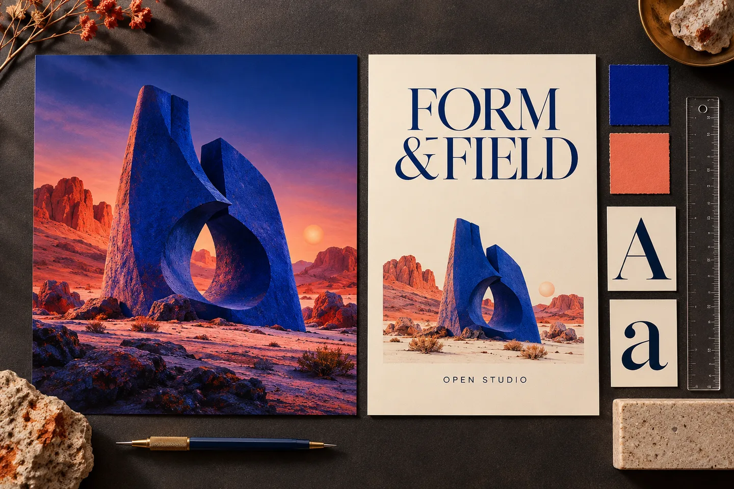
Original generated concept illustration of two deliverable types. Neither print is presented as a Craft or Midjourney test result.
Route one: develop the design as a complete composition
Choose this route when the headline and placement already exist. A campaign team may know that the subject must occupy the lower half and the headline must remain prominent in a portrait poster.
A suitable brief is:
Create a portrait exhibition poster with the exact headline "FORM & FIELD" in large dark letters in the upper third. Place a smaller line "OPEN STUDIO" beneath it. Show an abstract cobalt sculpture in a coral desert in the lower half. Use a warm cream field around the text, restrained shadows, and generous margins. Keep the sculpture completely visible and include no extra wording.
Craft is a sensible first candidate because you are asking it to arrange the complete design. Evaluate whether the image, lettering, and quiet areas work together. Do not approve a poster only because its central sculpture looks impressive.
If the title dominates too much, revise its relationship to the subject. If the desert texture competes with the copy, ask for a calmer text area. Those are layout changes, not a request for a vague increase in quality.
Keep the detailed technique in the Craft prompt guide. For a comparison, the important decision is whether the complete-composition route reduces the work left before approval.
Route two: establish artwork before arranging the copy
Choose an artwork-first route when the team has not agreed on the visual mood. Perhaps the sculpture should feel monumental and cinematic, or perhaps a quiet editorial treatment would be more appropriate. You need to see a few directions before committing to a layout.
For an initial artwork exploration, try a brief such as:
An abstract cobalt sculpture standing in a coral desert at twilight, strong geometric silhouette, low warm light, rich mineral surfaces, a quiet horizon, and enough pale sky for typography to be added later. Editorial campaign artwork, no lettering.
In Midjourney, set the version and shape deliberately and record any stylization or personalization controls. Its parameter documentation explains controls for aspect ratio, artistic treatment, and other settings. A preference profile can influence a result, so two people using the same wording may not be running equivalent evaluations.
Review the selected artwork inside the intended layout. Does the headline fit without covering the sculpture? Is there room for the venue? Will the strongest feature survive a square crop? If not, revise the artwork's composition before spending time on typography.
This route has a real tradeoff: choosing an image and finishing the design are separate tasks. That can give a designer useful control, but it adds a finishing step that should be included in the time and cost comparison.
Compare generated text without pretending the task is solved
Midjourney can generate text; it should not be dismissed as a tool with no lettering support. Its text-generation guidance recommends double quotation marks and notes that shorter Latin-alphabet phrases are a better fit. It also suggests adjustments when the wording is wrong.
For a fair text trial, ask both candidates for the same short headline. Compare exact characters, line breaks, contrast, and integration with the artwork. Test longer factual copy separately rather than extrapolating from a successful two-word title.
Craft's typography focus is a reason to include it in that trial, not a guarantee that every word will be correct. A date, price, or unfamiliar place name still deserves a direct check against the approved copy.
When the deliverable includes several factual lines, use editable typography for final production if that provides a clearer route to accuracy. The poster text guide explains when to stop regenerating the scene and finish the wording separately.
Make changes without losing the approved direction
After selecting an image, request one revision at a time. A useful first change is to create more space above the sculpture while preserving the horizon, palette, and subject. A second might soften the light without changing the sculpture's silhouette.
Compare each result to the previous approved version. Look for unintended changes in the geometry, colors, texture, and lettering. Keep a copy of the approved artwork before every edit so that a later variation does not become the only surviving file.
Do not assume that an edit button means the same thing as an editable design object. Image editing can change pixels; a layout document may let you select a title or shape independently. Inspect the actual handoff format required by the client or team.
If revisions must preserve many specific details over several rounds, add GPT Image 2.5 to your evaluation rather than forcing a two-model choice to cover every production need.
Plan for every destination, not just the strongest crop
A wide hero image and a portrait poster have different spatial demands. A dramatic horizon may help the wide asset but leave too little room for a portrait title. A large central subject may work in a square and block every text area in a tall layout.
Before generating, list the required shapes and the nonnegotiable content in each. Recompose the subject and copy areas where needed. Do not promise that one output can be cropped into every placement without checking it.
The aspect ratio and resolution guide covers the file checks. For this decision, the question is how much adaptation remains after choosing the artwork: a straightforward layout adjustment, a new composition, or several additional generations.
Compare the complete cost of the route
Midjourney's plan comparison lists Basic at $10 and Standard at $30 when billed monthly, as checked on October 23, 2026. Annual billing has different effective monthly figures, and GPU-time and mode allowances vary by plan.
Those subscription figures are not fixed prices per approved poster. For Craft in this workflow, inspect the displayed credit quote and plan options. Use the purchase channel and allowance that match your actual work instead of converting unlike plans into a superficial “cheapest image” claim.
Track three things separately: generation spending, the number of approved deliverables, and human finishing time. A month of exploration may justify a subscription for one team; an occasional task may have a different purchase pattern. An artwork-first route should include the time spent placing and checking the final copy.
A hypothetical project with six approved posters from thirty candidate images has five candidate images per approved poster. That number is not a prediction for either tool. It simply shows why the first-generation price cannot describe the whole job.
Which should you use for your campaign?
Start with Craft when your challenge is the complete arrangement: a known message, a subject, supporting text, and a clear hierarchy. Start with Midjourney V8.2 when discovering an artistic direction is the main task and you expect to finish the layout around the selected image.
For a fair decision, use one exhibition brief, keep the intended shape consistent, record settings, and inspect the final deliverable. Choose based on the work required to get an approved design, not the most attractive isolated sample.
For campaigns driven by existing reference photos or larger output requirements, see Craft vs Nano Banana 2.1. For your next layout-led concept, start with a clear Craft brief and decide in advance which parts of the design must remain editable.
Sources checked October 23, 2026. Recommendations are based on documented capabilities and task analysis; no model-specific success rate, artistic ranking, or speed measurement is claimed.